
CHULA VISTA
Exploratory rebrand project for the City of Chula Vista.
ROLE
Brand Identity, Logo Design, Brand Application
INDUSTRY
Public Relations
An exploratory rebrand for the City of Chula Vista, developed as an independent study in how the city’s existing visual identity could be simplified, modernized, and made more flexible across civic applications.

The concept builds on familiar elements from the city’s existing identity, including the sun, landscape, and water. These elements were redrawn into a simpler geometric mark designed to feel recognizable while creating a cleaner and more contemporary visual presence.
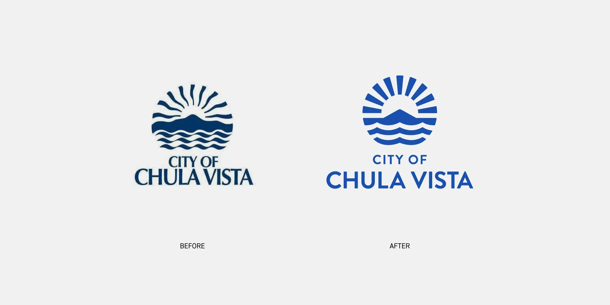
Rather than replacing the character of the existing identity, the approach focused on refinement. The original symbol was reduced to its essential forms, paired with updated typography, and reorganized into a more flexible system that could work across a wide range of scales and formats.
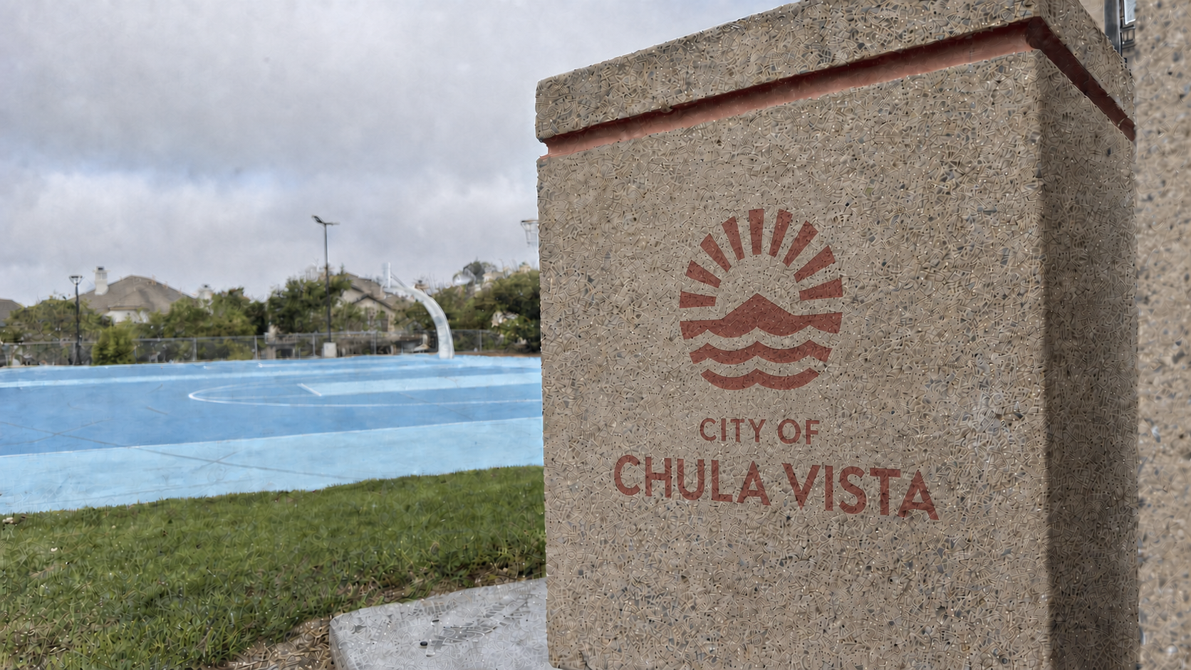
The simplified mark was designed to translate easily across everyday civic touchpoints, from city vehicles and employee equipment to bags, signage, and other public-facing applications. The goal was to create an identity that could remain clear and recognizable whether used as a full signature or as a standalone symbol.
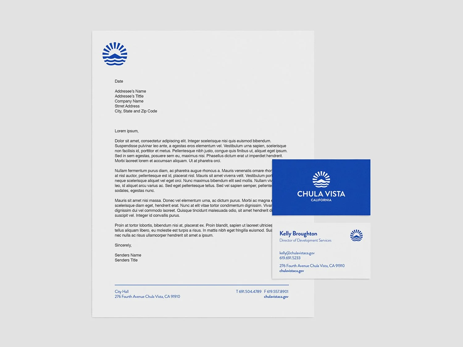
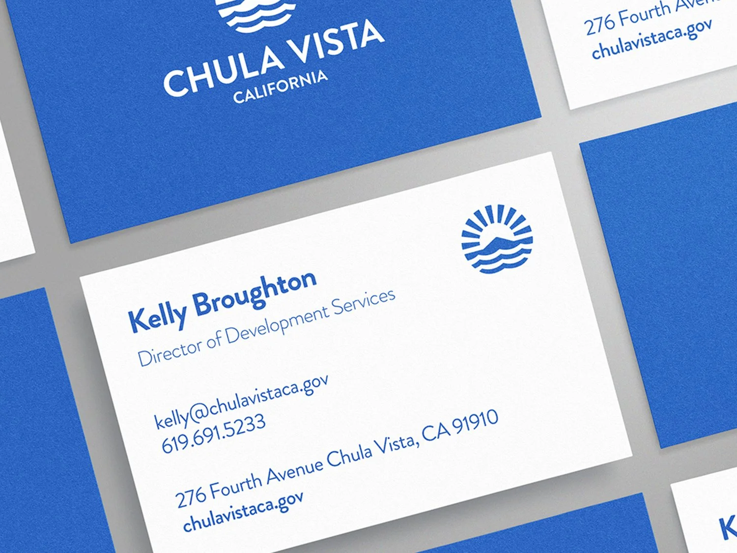
The identity was extended into stationery and administrative materials to explore how the system could function in more formal settings. A consistent use of typography, color, and the city mark creates a unified visual language across both public-facing and internal communications.