FISH GUTS
Brand identity and signage for the best fish taco restaurant in San Diego.
ROLE
Brand Identity, Art Direction
INDUSTRY
Restaurant, Hospitality

A San Diego seafood restaurant concept rooted in family tradition and a daily commitment to freshness. The brand celebrates locally sourced catches and scratch-made recipes with a bold, modern identity. The system is designed to feel confident, coastal, and unmistakable—capturing the energy of Fish Guts’ taco-forward dining experience.
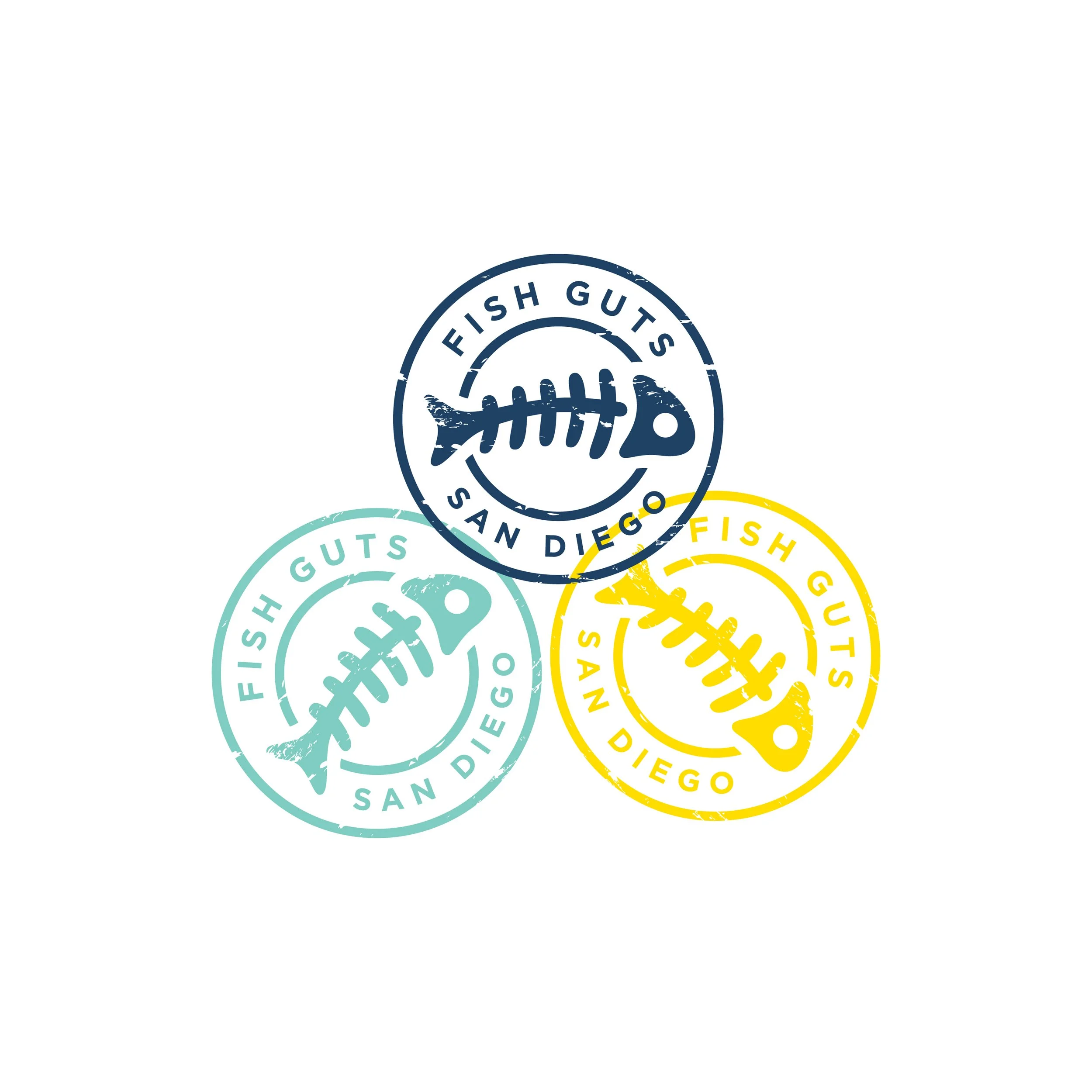
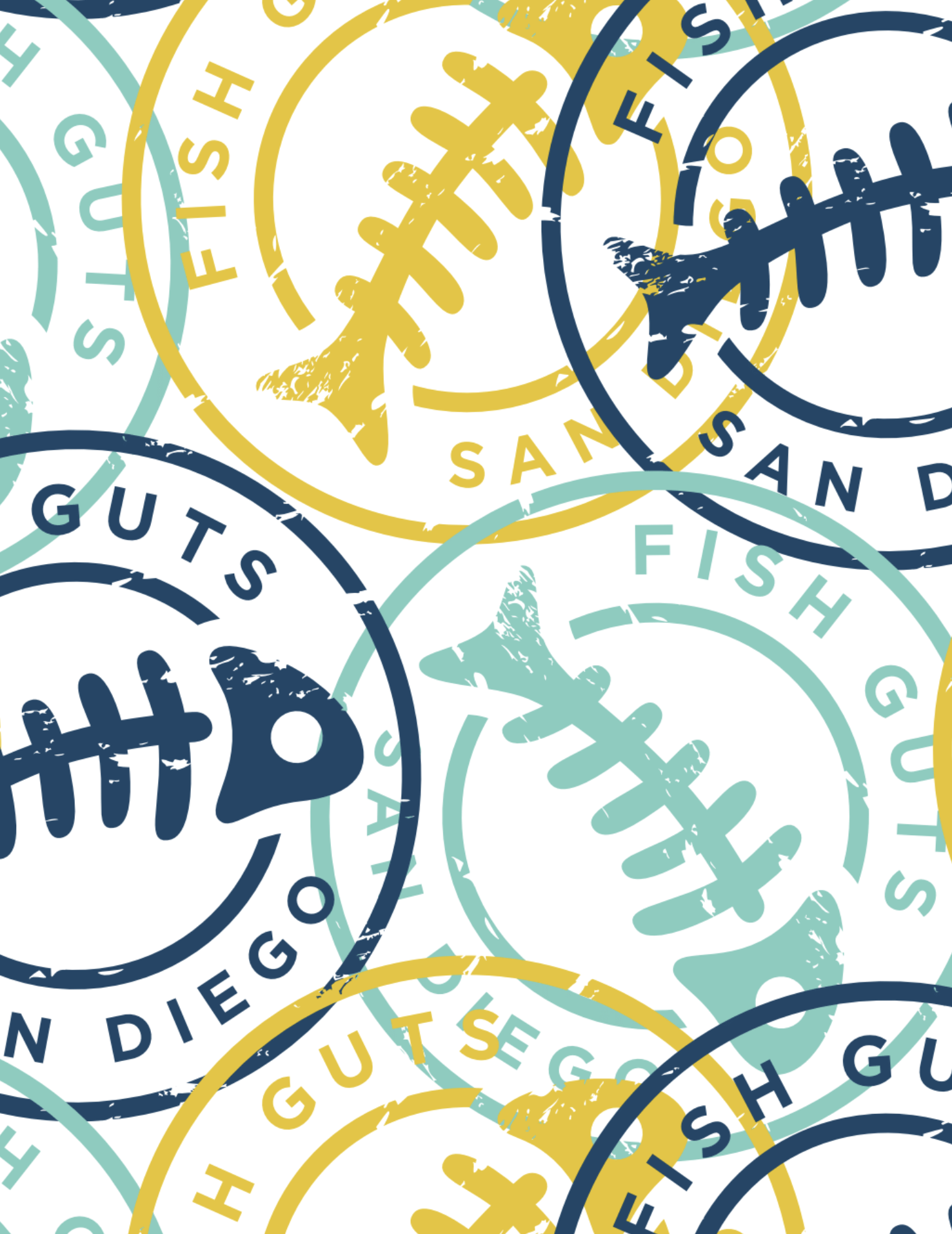
Fish Guts needed a mark that could travel. The passport-style stamp became the foundation, a repeatable symbol that feels local, handmade, and official. It holds up in a single color, works in multiple palettes, and turns into pattern when the brand needs to show off.

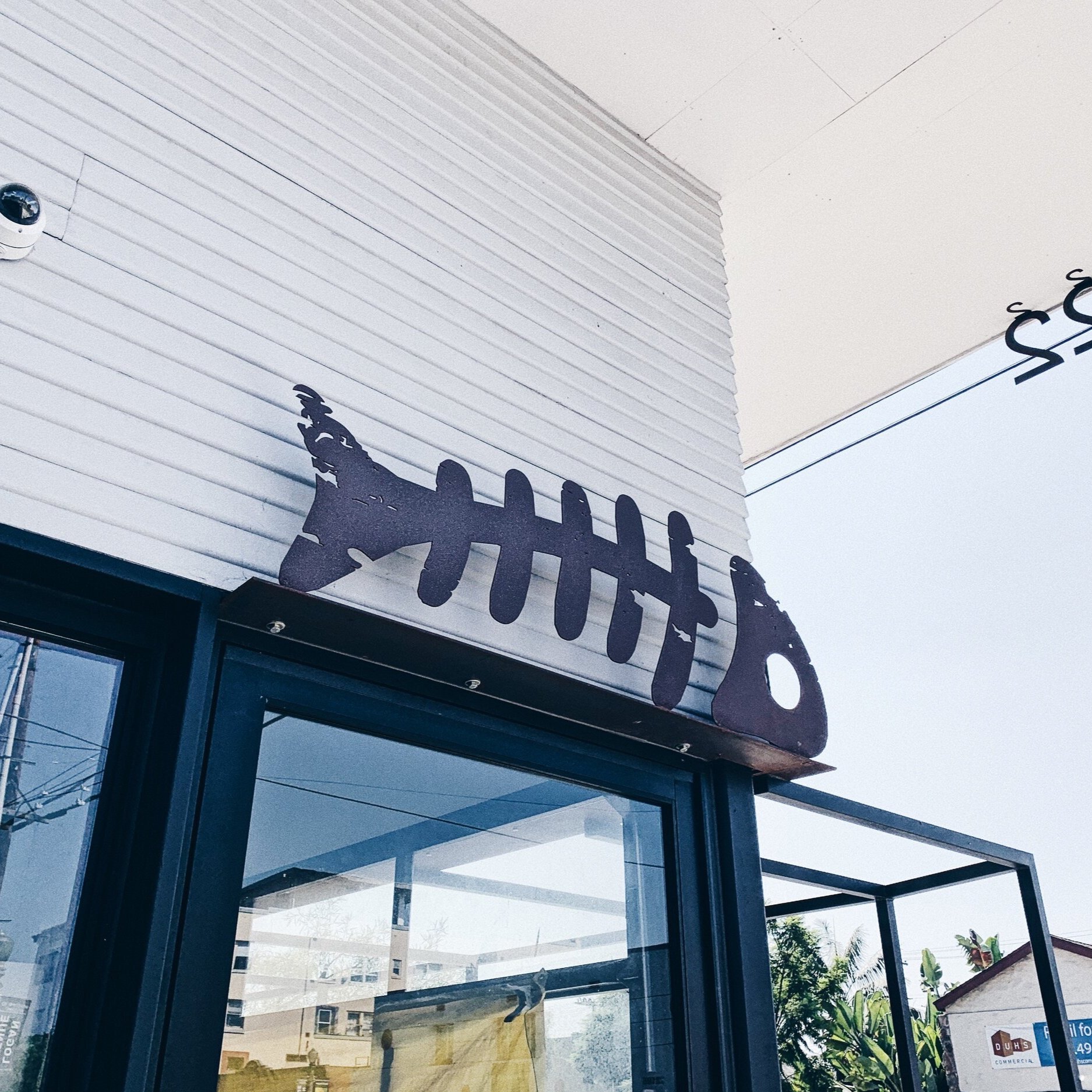
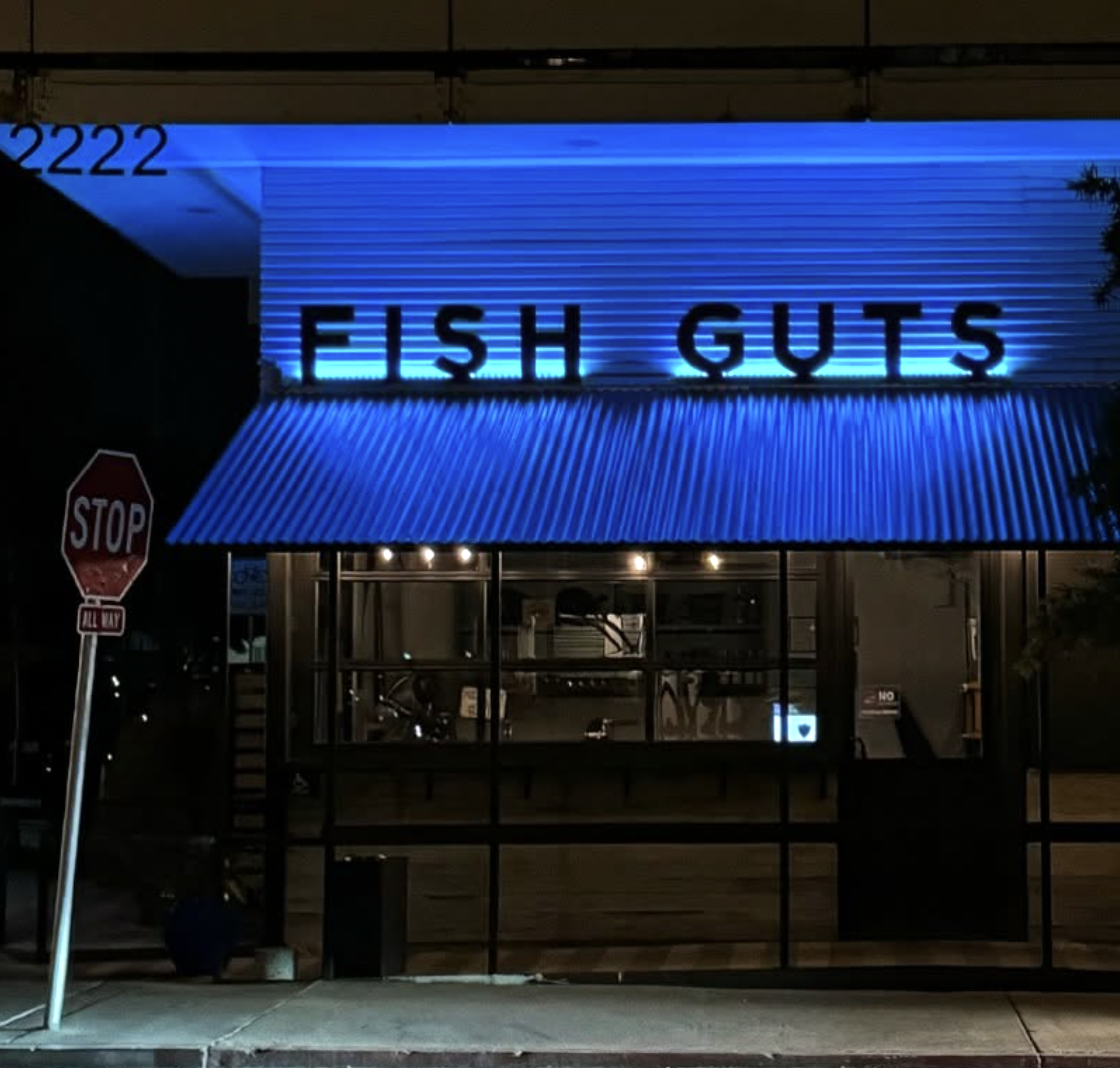
The exterior signage is cut from blackened metal as a bold, no-nonsense statement. It’s a nod to the toughness of working fishermen and the grit behind the daily catch. Simple in form and heavy in presence, the mark reads from the street and feels permanent on the building.
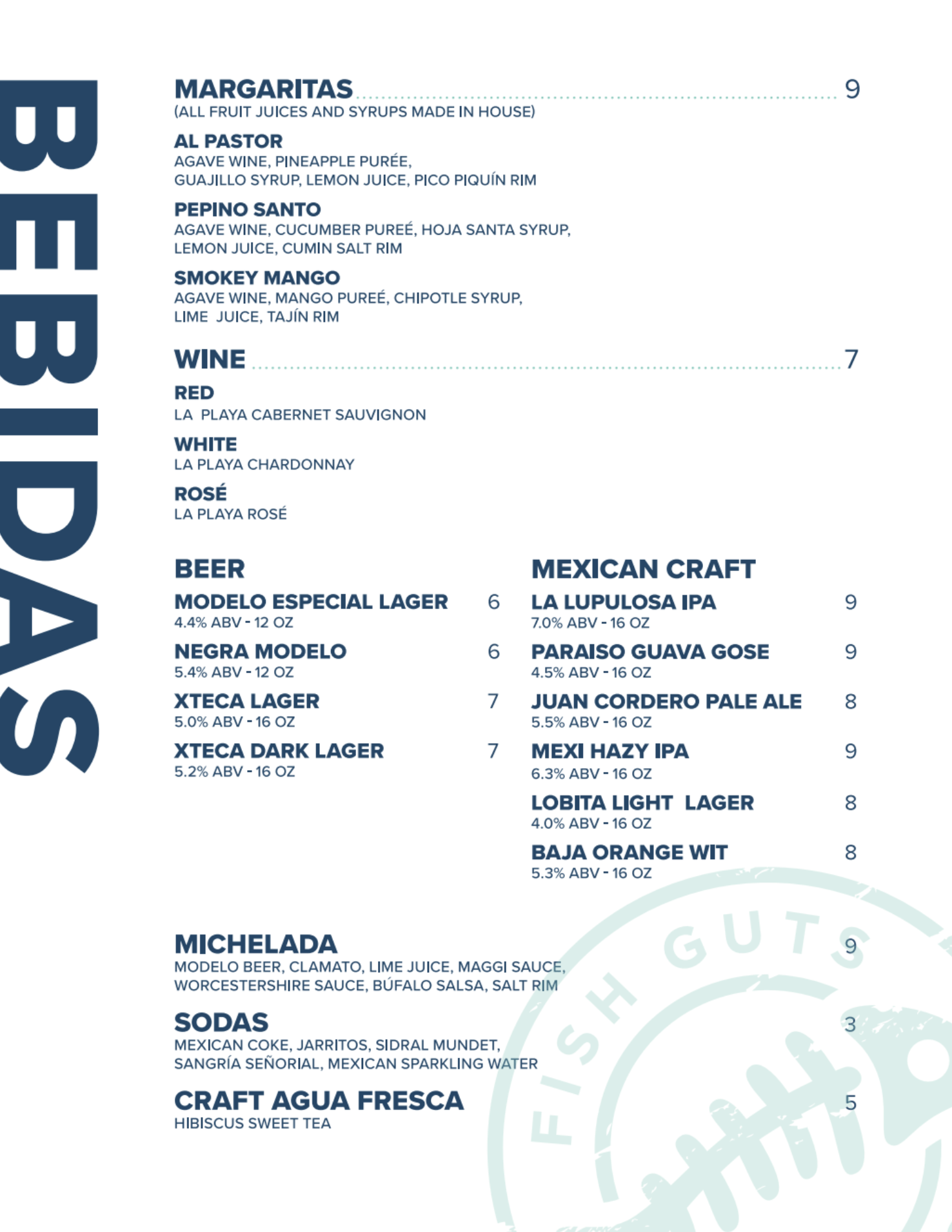
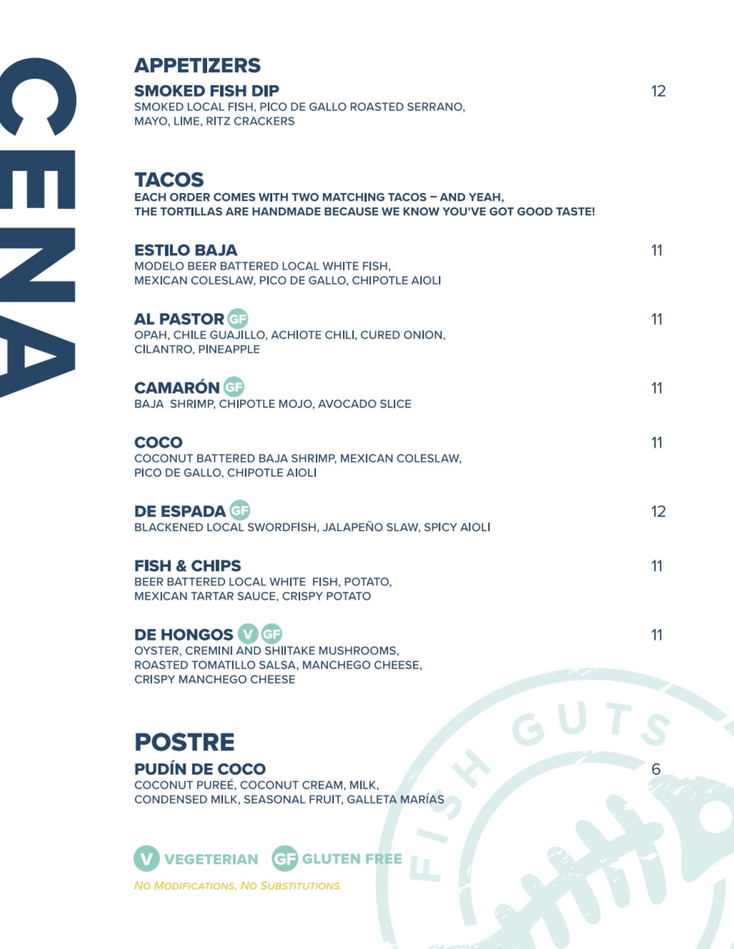
The menu system was designed to feel as clean and confident as the brand itself. Strong hierarchy and generous spacing make items easy to scan, while the stamp pattern on the back adds energy without competing with the content. The result is a layout that balances function and character—built for quick decisions at the table and consistent use across future seasonal updates.
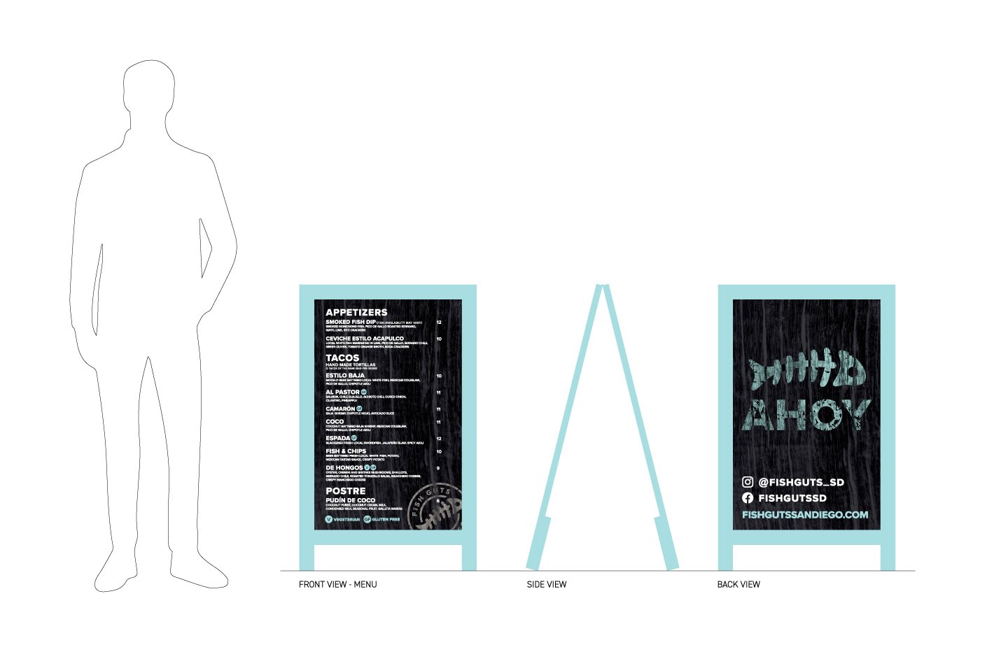
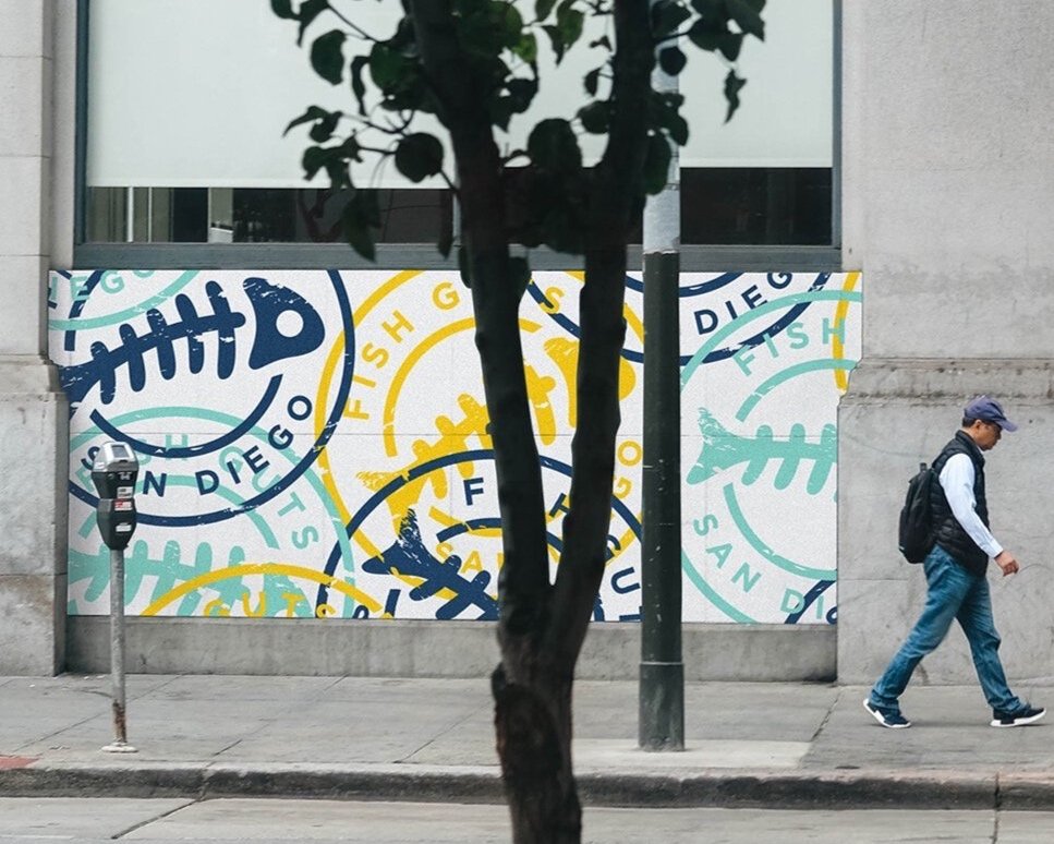
To bring the brand to the sidewalk, we designed a set of sandwich board menu signs built for street-level clarity. The layout is bold, readable, and structured for quick scanning, while the weathered texture and stamp details tie back to the core identity. The reverse side reinforces the brand with a simple “Ahoy” callout and social handles to pull walk-by traffic into the Fish Guts world.

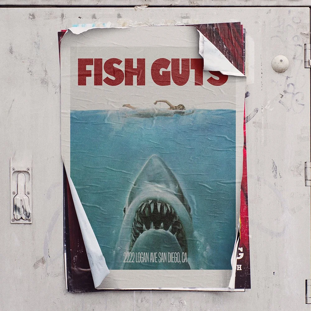
To build anticipation ahead of opening, we created a series of guerrilla-style posters inspired by iconic movie artwork. Each poster reimagines a familiar composition, replacing the title with FISH GUTS in typography that matches the original style. Plastered around town, the set sparked curiosity, created shareable moments, and helped the brand feel instantly embedded in the city before the doors even opened.
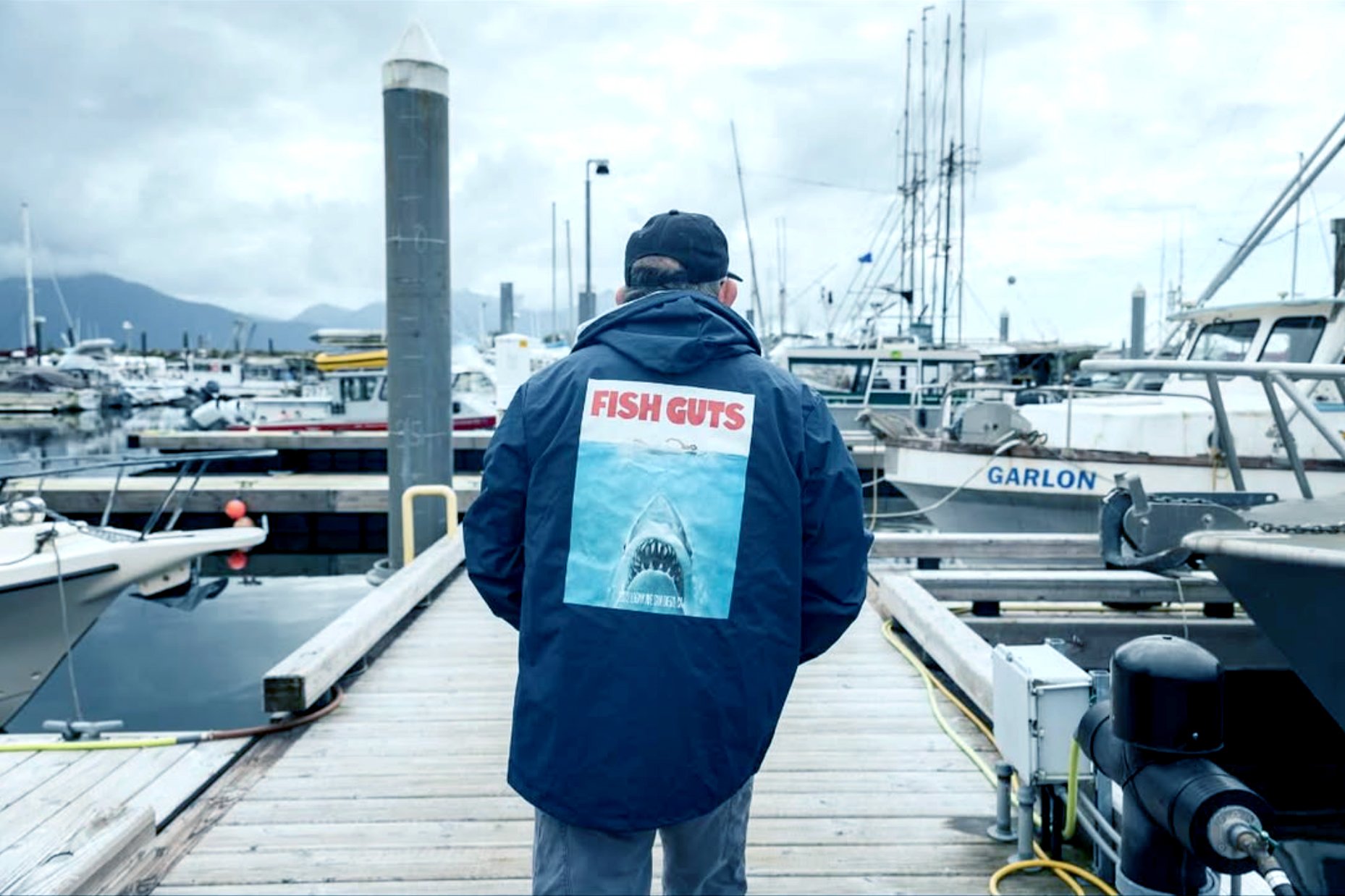
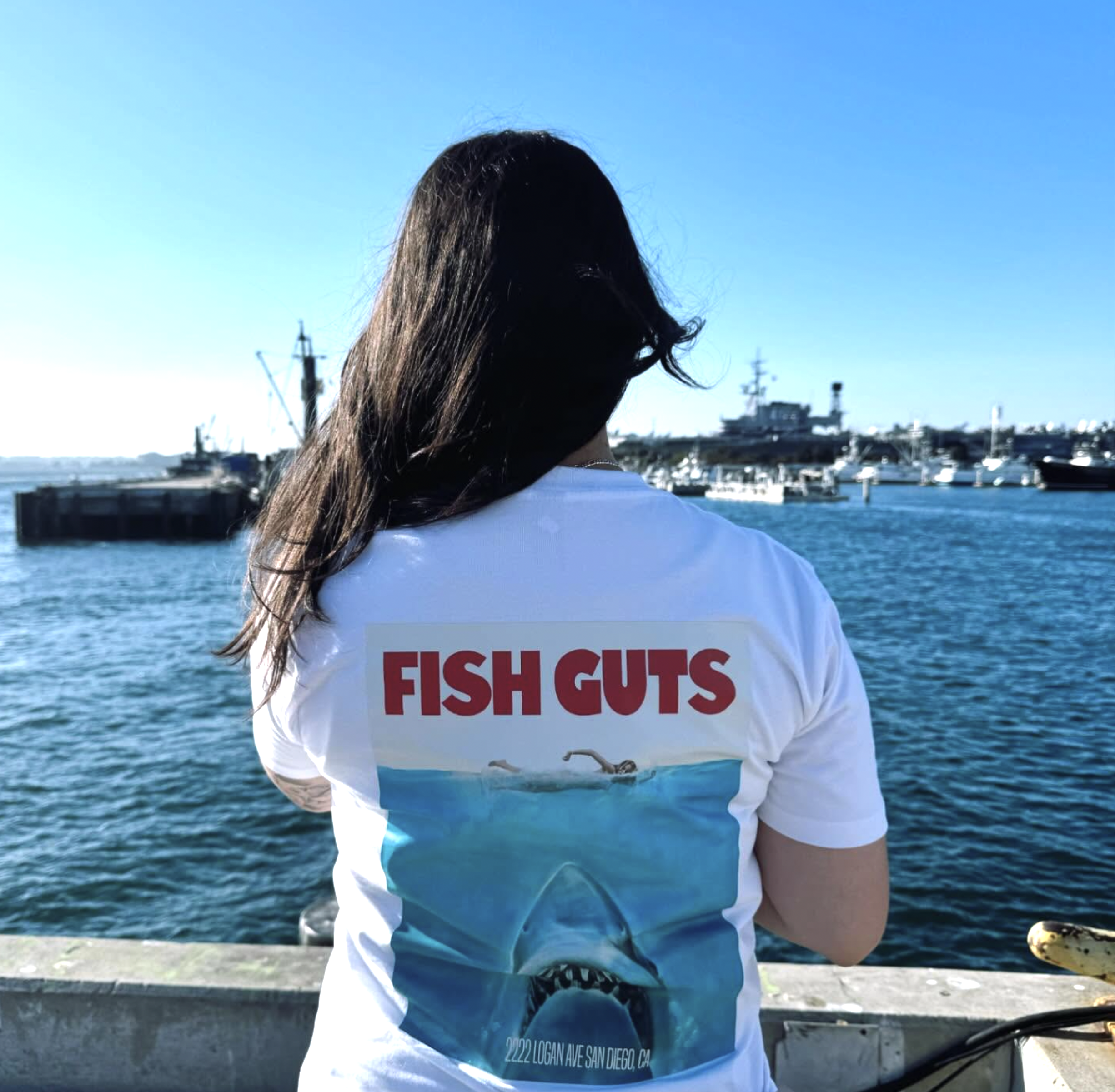
As the guerrilla campaign gained traction, the merch became the natural next catch. The poster art shifted from street wheatpastes to wearable pieces, turning early buzz into walking billboards.
Fish Guts proves that a strong identity is more than a logo—it’s a system that shows up everywhere. The stamp mark, street menus, and metal signage establish a bold foundation, while murals, posters, and merch push the brand into the city itself. Built to be seen, shared, and repeated, the result is an identity that feels local from day one.