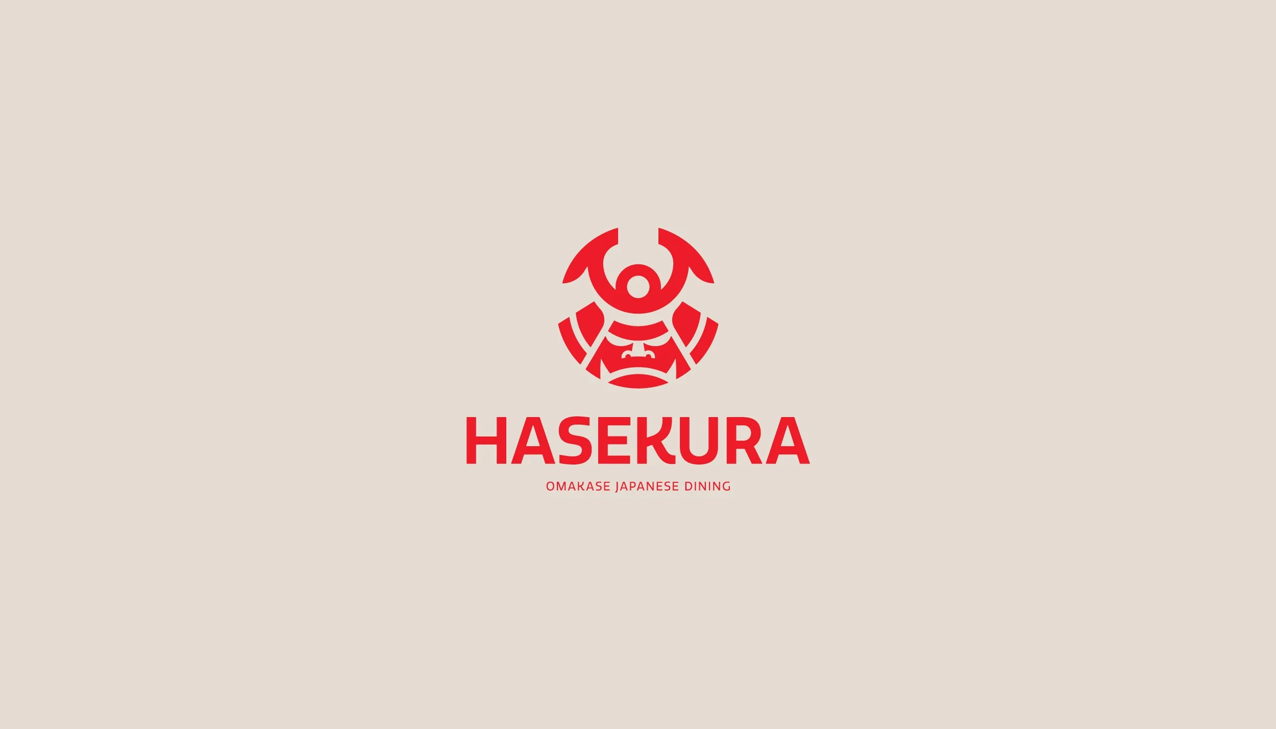
HASEKURA
Brand identity for a samurai-inspired restaurant.
ROLE
Identity, Signage, Packaging
INDUSTRY
Food & Beverage
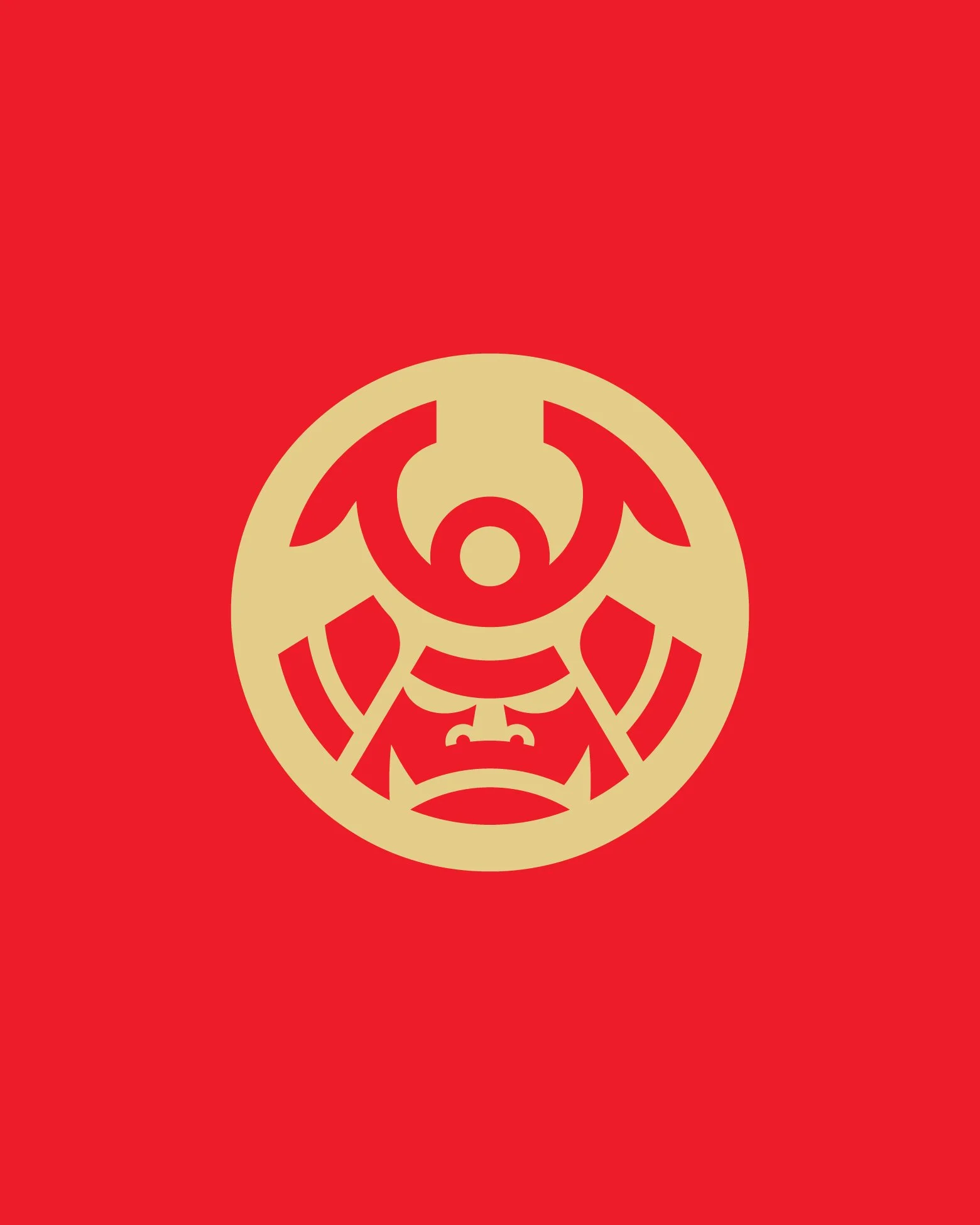

A refined omakase restaurant concept inspired by the spirit and discipline of the samurai. The designs evoke strength, precision, and heritage—merging traditional Japanese armor motifs with a bold, modern aesthetic. The mark captures the essence of HASEKURA’s immersive and intentional dining experience.
Note: This project is currently on hold.
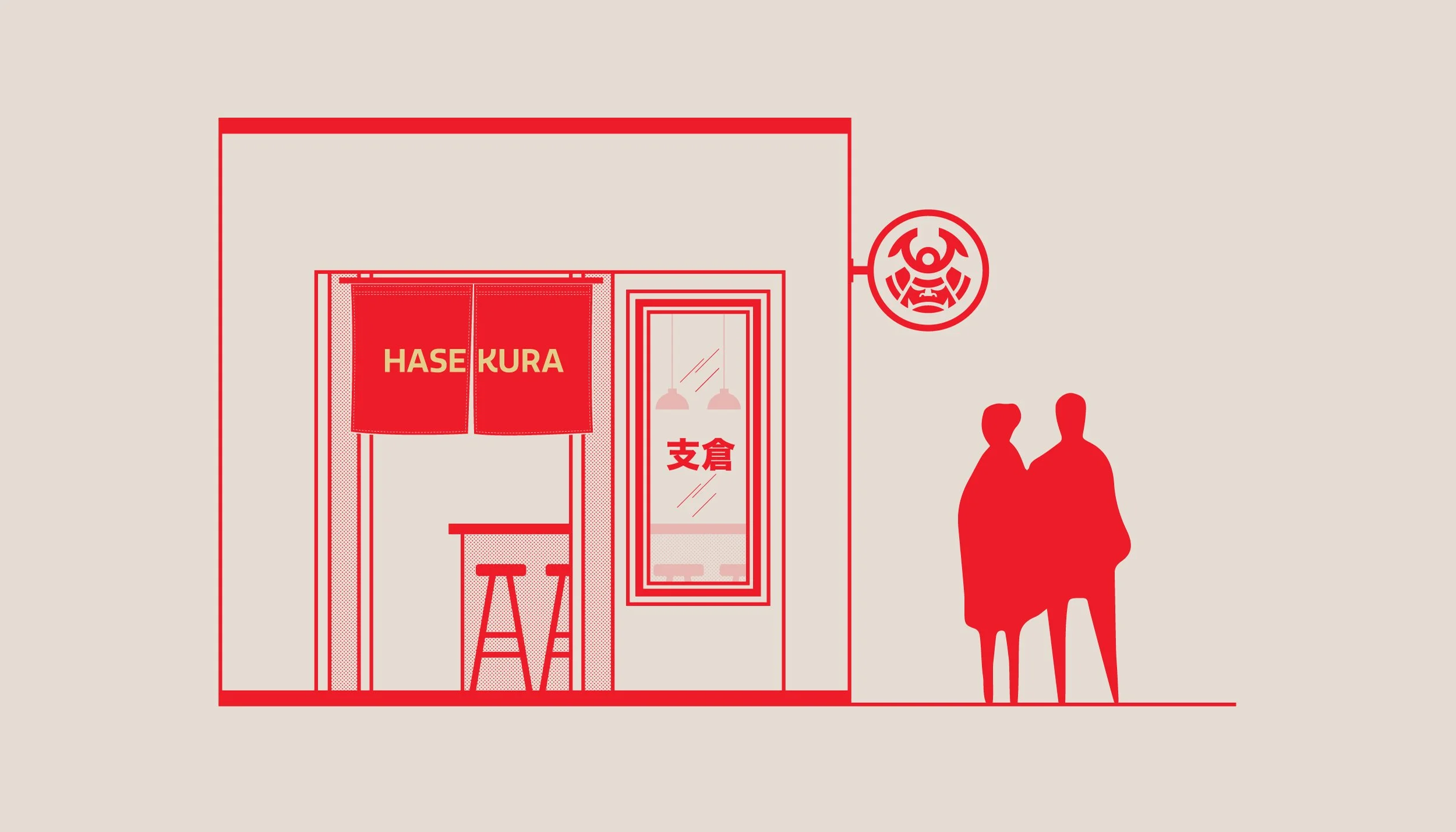
This conceptual elevation for HASEKURA highlights a minimalist storefront rooted in Japanese tradition. One of the key features is the noren—the red curtain hanging at the entrance—traditionally used in Japanese eateries to signal openness and welcome. Here, it's emblazoned with the restaurant's name in clean, bold typography, bridging cultural authenticity with modern branding. The noren not only frames the entry but also sets the tone for the omakase experience inside—intentional, intimate, and steeped in quiet ritual.
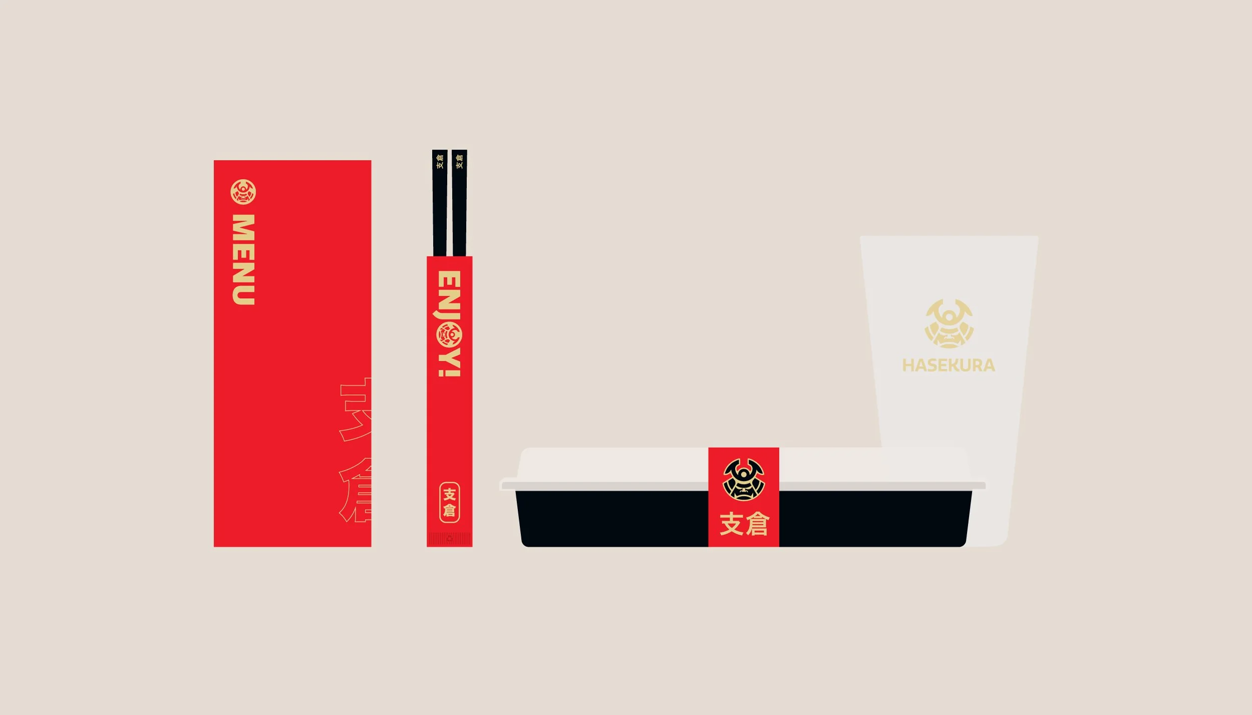
The packaging design for HASEKURA is a deliberate extension of the restaurant’s identity: clean, bold, and rooted in symbolism. Every touchpoint, from the chopstick sleeve to the takeout container, reinforces the brand’s samurai-inspired narrative with graphic precision and restraint.
The use of vibrant red and soft gold evokes both modern energy and historical richness. Custom kanji accents (支倉) provide cultural authenticity, while the bold “ENJOY!” on the chopstick wrap adds a friendly contrast to the otherwise stoic design system. The takeout band and logo act as a visual signature, minimal yet memorable, anchored by a stylized mon crest that nods to traditional Japanese emblems.
This system was designed not just for form but for ritual, with each piece meant to feel like part of an intentional, elevated experience, even outside the restaurant.
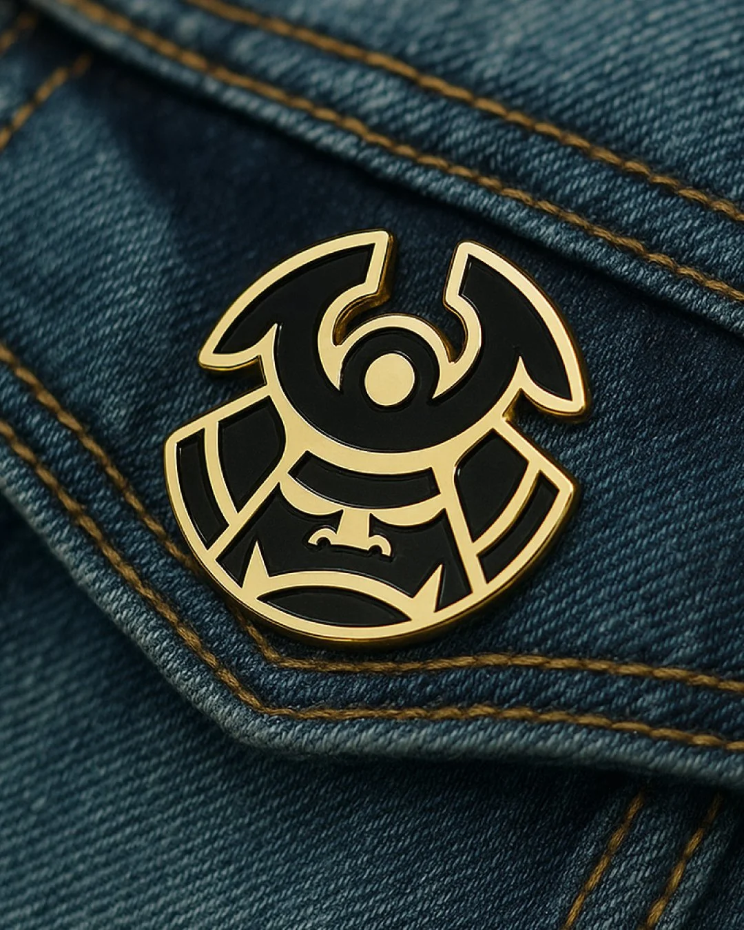

The merch system for HASEKURA extends the brand's visual identity into tactile, wearable pieces designed to feel both iconic and understated. At the heart of it is the custom mon-inspired emblem, which serves as a modern crest—simple in form but rich in cultural reference.
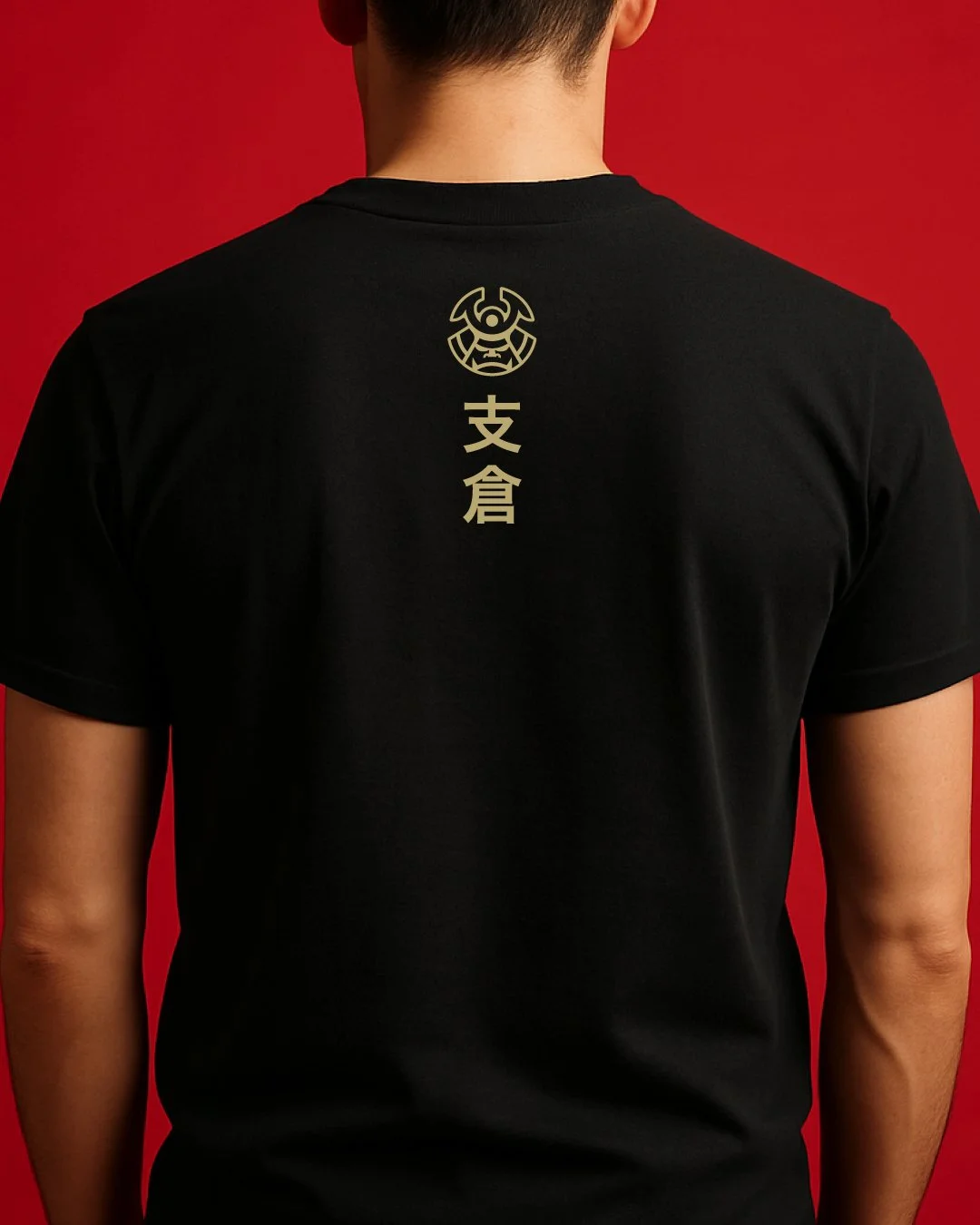
The enamel pin features a striking gold-and-black finish, creating a collectible piece that blends streetwear edge with traditional symbolism. On apparel, the back of the staff tee is vertically stacked with the brandmark and kanji (支倉), creating a refined yet bold presence. The red cap uses a tonal embroidery treatment, balancing saturation with subtlety and giving the mark an elevated, uniform feel.
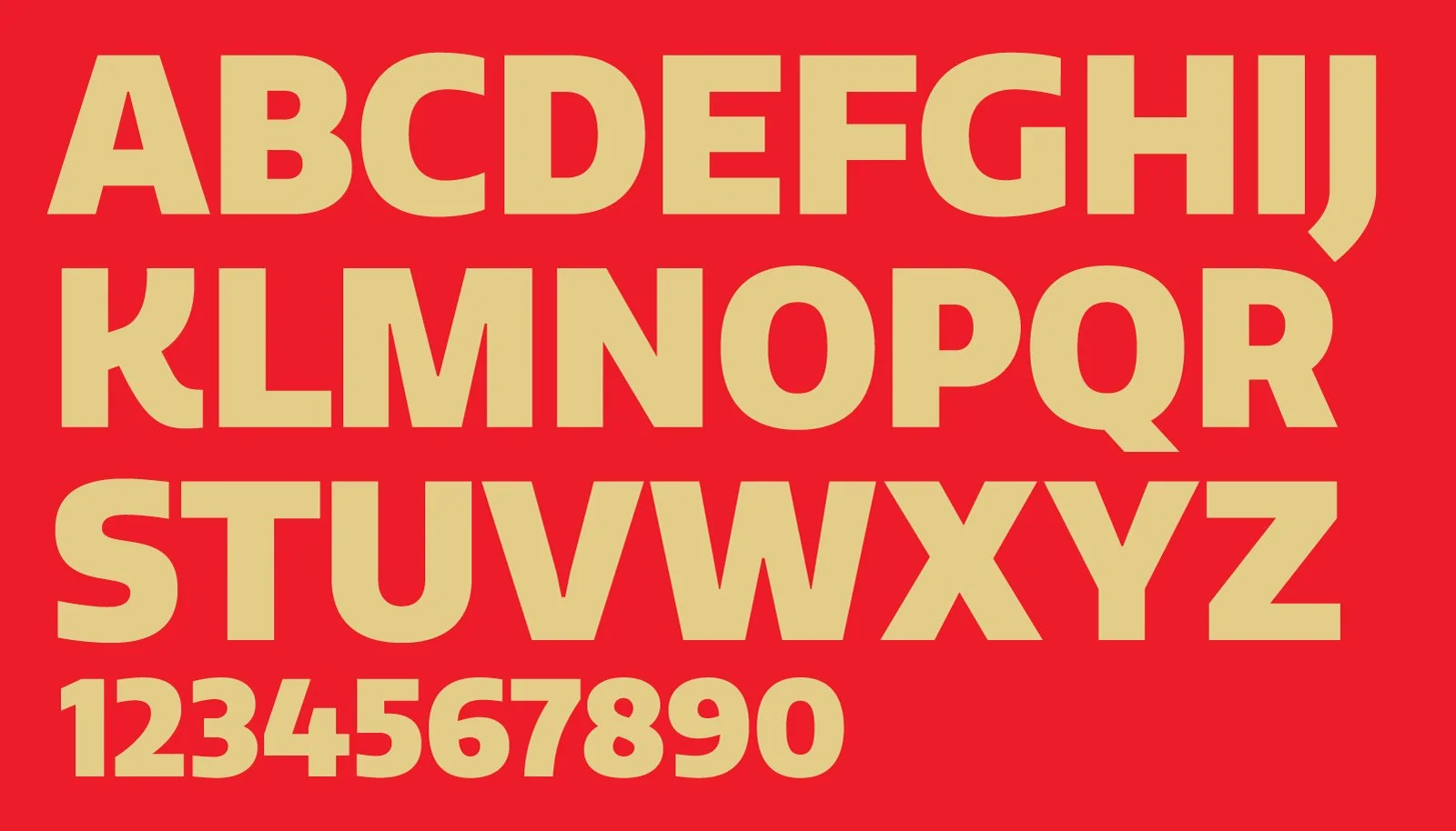
Typography plays a key role in the HASEKURA identity, delivering clarity with a confident tone. The brand uses Quatro, a bold and geometric sans-serif designed by Mark Caneso, to communicate with impact and precision across digital, print, and environmental touchpoints.
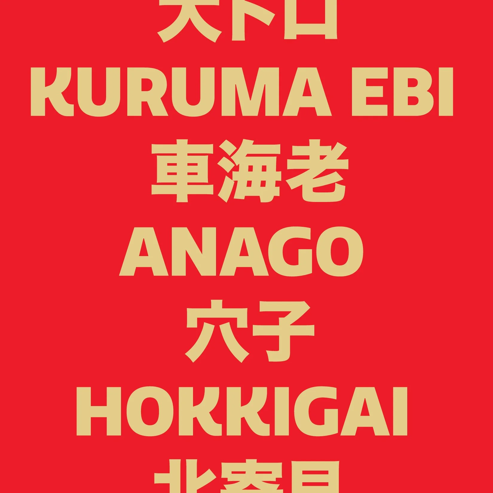
In menu callouts, signage, and educational graphics (like this sushi kanji pairing), Quatro’s clean lines and modern rhythm help balance the traditional influences of the brand with a fresh, contemporary edge. Its strong verticality pairs beautifully with Japanese characters, allowing bilingual compositions to feel unified and intentional.
It’s not just type—it’s voice, presence, and visual gravity, all in one.
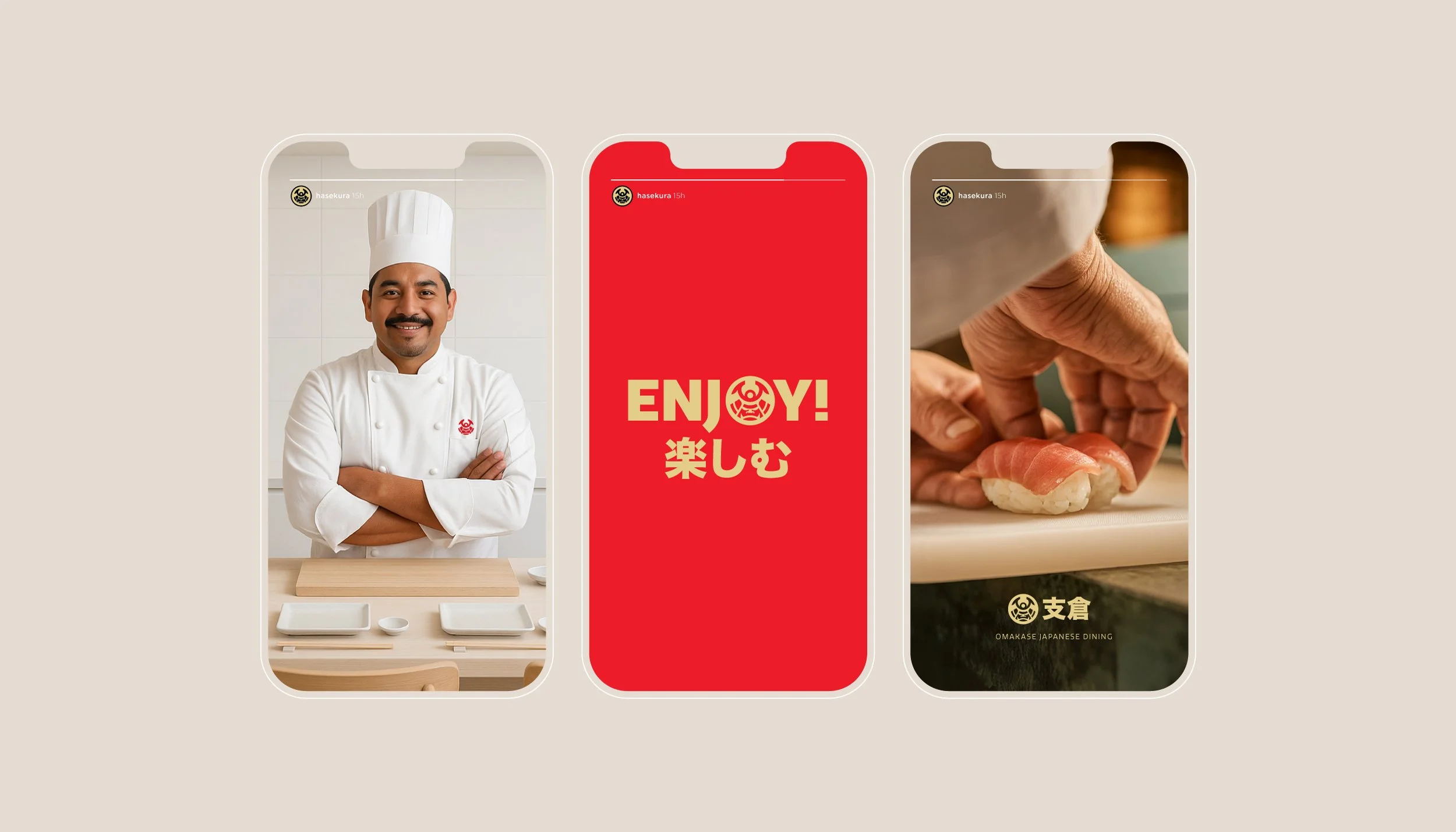
The HASEKURA brand extends seamlessly into social media, where every story and post becomes an opportunity to communicate craft, culture, and character. The visual language stays consistent—minimal layouts, bold color use, and the signature mon emblem—while allowing the food and team to take center stage.